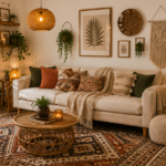

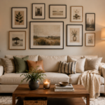
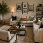
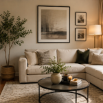

Staring at a blank wall with a stack of frames and no plan is a common decorating problem. You want that curated look. But the moment you pick up a hammer, the confidence disappears. That’s exactly where good gallery wall ideas earn their keep — they turn a pile of frames into a focal point instead of a cluttered mess.
In this guide, we’ll walk through everything you need to plan, arrange, and hang a gallery wall that looks intentional. You’ll get proven gallery wall layout templates you can trace or recreate. You’ll also get practical hanging tips and framing tricks that pull the whole thing together. Whether you’re filling a stairwell, a hallway, or the space above your sofa, there’s a layout here that fits. If you’re also working on the room around it, our guide to small living room decor on a budget pairs well with these gallery wall ideas.
What Is a Gallery Wall, Exactly?
A gallery wall is a curated arrangement of framed art, photos, mirrors, or objects displayed together on a single wall. This display style has roots in the traditional salon-style hanging used in 19th-century European art exhibitions, where paintings covered walls from floor to ceiling. What separates a great gallery wall from a jumbled one isn’t the number of pieces. It’s the spacing, alignment, and visual rhythm between them. A well-planned gallery wall can include anywhere from three frames to thirty. It works in almost any room: living rooms, bedrooms, entryways, offices, and even bathrooms.
The appeal is practical, too. Instead of buying one large, often expensive statement piece, a gallery wall lets you combine smaller, more affordable items. Thrifted frames, family photos, travel prints, and kids’ artwork can all come together into one cohesive design.
Popular Gallery Wall Layout Templates to Try
If you’re not naturally great at eyeballing spacing, working from a template takes the guesswork out of the process. Here are the gallery wall layout templates that consistently show up in professionally designed spaces.
Grid Layout Gallery Wall Ideas
Frames of the same size are arranged in even rows and columns with identical spacing between each one. This is the most forgiving layout for beginners because the math does the work for you. Measure once, then repeat the pattern. Grids look best with matching frame colors and a consistent theme, like black-and-white photography or botanical prints.
Salon-Style Cluster Gallery Wall
This is the eclectic, floor-to-ceiling look you’ve probably seen in boutique hotels or design magazines. Frames of different sizes, shapes, and orientations are layered close together with minimal gaps. It’s more forgiving of imperfection than a grid. That makes it a great choice if your frame collection is already a mix-and-match assortment.
Symmetrical Gallery Wall Layout
A large central piece is flanked by smaller, mirrored frames on either side. This template feels formal and balanced. It’s a strong option for dining rooms, entryways, or above a mantel where you want a sense of order.
Linear Row Gallery Wall
A single horizontal or vertical line of frames, evenly spaced. This works especially well in narrow spots like hallways, staircases, or above a console table, where a bulkier cluster wouldn’t fit.
Free-Form Scatter Gallery Wall
An intentionally organic, asymmetrical arrangement with varied gaps between frames. It takes a bit more confidence to pull off. But it’s the most flexible of all the gallery wall layout templates if you’re adding pieces to your collection over time.
Quick answer: The easiest gallery wall layout template for beginners is the grid layout, because equal spacing and matching frame sizes remove most of the guesswork.
How to Plan Your Gallery Wall Before You Hammer Anything
A little prep work saves you from a wall full of unnecessary nail holes.
Trace Your Layout on Paper First
Cut kraft paper or newspaper to the exact size of each frame. Tape the paper templates to the wall using painter’s tape. This lets you step back, adjust spacing, and visualize the final look before committing to a single hole.
Lay Out Your Gallery Wall Ideas on the Floor
Before taping anything to the wall, arrange your frames on the floor in your chosen layout. Photograph it from above so you have a reference to work from as you move pieces to the wall.
Decide on a Unifying Element for Your Gallery Wall
Great gallery walls typically share one consistent thread, even if everything else varies. That could be:
- A matching frame color (all black, all natural wood, all gold)
- A consistent color palette in the artwork itself
- A shared subject matter (family photos, travel shots, abstract art)
- Matching mat board width
Without a unifying element, even a well-spaced layout can start to feel chaotic. This is one of the most common gallery wall mistakes, and it’s an easy one to fix before you start hanging anything.
Gallery Wall Hanging Tips That Prevent Common Mistakes
Start From the Center Piece
If your layout has an anchor frame, hang it first at eye level, roughly 57 to 60 inches from the floor to the center of the piece. Then build outward. This keeps the whole arrangement centered around a natural focal point.
Keep Spacing Consistent
Leave 2 to 3 inches between frames for a cohesive, gallery-style look. Wider gaps start to read as separate groupings rather than one unified wall.
Use a Level and a Hanging Strip
A small bubble level prevents the slow drift that happens when you eyeball each frame. For lightweight pieces, adhesive hanging strips reduce wall damage. They also make small adjustments easier than repositioning a nail.
Account for Furniture Below Your Gallery Wall
If the gallery wall sits above a sofa, console, or headboard, the full arrangement should generally be about two-thirds the width of the furniture piece below it. That keeps the grouping feeling proportionate rather than floating. If you’re rethinking the seating layout too, our sofa styling ideas guide has more tips on getting that balance right.
Gallery Wall Framing Secrets for a Polished, Cohesive Look
Mix Frame Styles Sparingly
You don’t need every frame to match exactly. But limiting your palette to two or three finishes, like black and natural wood, keeps a mixed layout from feeling random.
Use Mats for Visual Breathing Room
A mat board around smaller prints adds visual weight. It makes them feel more substantial next to larger frames and gives the eye a consistent resting point across the wall.
Vary Sizes, Not Just Content
If every frame in your collection is the same size, the wall can start to feel flat. Introduce at least one or two larger anchor pieces to create visual hierarchy, especially in salon-style or free-form layouts.
Don’t Overlook Non-Frame Elements
Small shelves, mirrors, or textural objects like woven wall hangings can be worked into a gallery wall. They break up the rectangle-after-rectangle repetition and add depth.
Gallery Wall Ideas by Room
- Living room: A salon-style or symmetrical layout above the sofa works well as a conversation-starting focal point. Pair it with a few of these small living room decor tricks if you’re working with limited space.
- Staircase: A linear or diagonal layout that follows the slope of the stairs makes the most of an awkward, angled space.
- Bedroom: A softer, smaller-scale grid or symmetrical layout above the headboard keeps the space feeling calm rather than busy.
- Home office: A free-form scatter mixing artwork, credentials, and personal photos adds character without looking cluttered.
- Entryway: A compact grid or linear row makes a strong first impression in a smaller footprint.
Frequently Asked Questions
How many frames do I need for a gallery wall? There’s no fixed number. Small gallery walls can work with as few as three to five frames, while larger salon-style walls often use fifteen or more. The right number depends on your wall size and chosen layout template.
What is the standard spacing between gallery wall frames? Most designers recommend leaving 2 to 3 inches between frames. This spacing is close enough to read as one cohesive grouping while still giving each piece room to stand out.
Should all my gallery wall frames match? No, but they should share at least one unifying element, such as frame color, mat style, or color palette, so the arrangement feels intentional rather than accidental.
What height should I hang my gallery wall? Center the overall arrangement at roughly 57 to 60 inches from the floor, which is standard eye level. If it’s above furniture, leave 6 to 8 inches of space between the furniture and the bottom of the frames.
Can I create a gallery wall without putting holes in the wall? Yes. Adhesive hanging strips or hooks rated for your frame weight are a solid renter-friendly option. They also make it easy to reposition frames while you’re still finalizing your layout.
Final Thoughts: Bringing Your Gallery Wall Ideas to Life
A great gallery wall isn’t about perfection. It’s about intention. Once you’ve settled on a layout template, planned your spacing on paper, and picked a unifying element, the actual hanging process becomes far less intimidating. Start small if you need to. You can always build onto a gallery wall as your collection grows, and revisit these gallery wall ideas whenever you add a new piece.
Ready to put these gallery wall ideas into action? Browse our frame collection or download our free printable layout templates to start planning your wall today.